Why Negative Space Is More Powerful Than You Think
Negative space isn’t just background it plays offense. It carries weight, defines rhythm, and shapes what we see as much as objects themselves. When used well, negative space guides the eye without yelling. It tells the viewer where to look, when to pause, and how to breathe with the image.
In 2026, artists aren’t just using negative space as filler. They’re flipping the dynamic letting the space do the talking. Graphic designers build logos that live in the gaps. Painters anchor meaning in what’s left blank. Even digital installations use absence as impact. The quiet of space becomes the main voice.
Good composition doesn’t need to scream. It needs to lead. Negative space does that with calm precision. The trick is to think of it not as what’s missing but as what’s working in the background, holding it all together.
Framing Your Focal Point
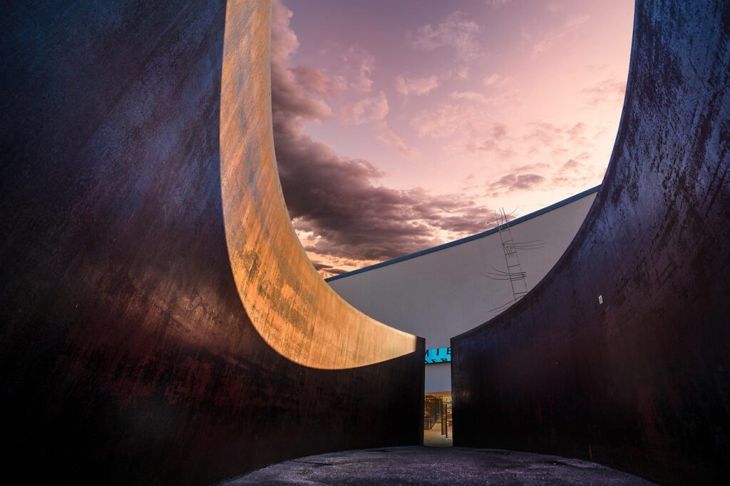
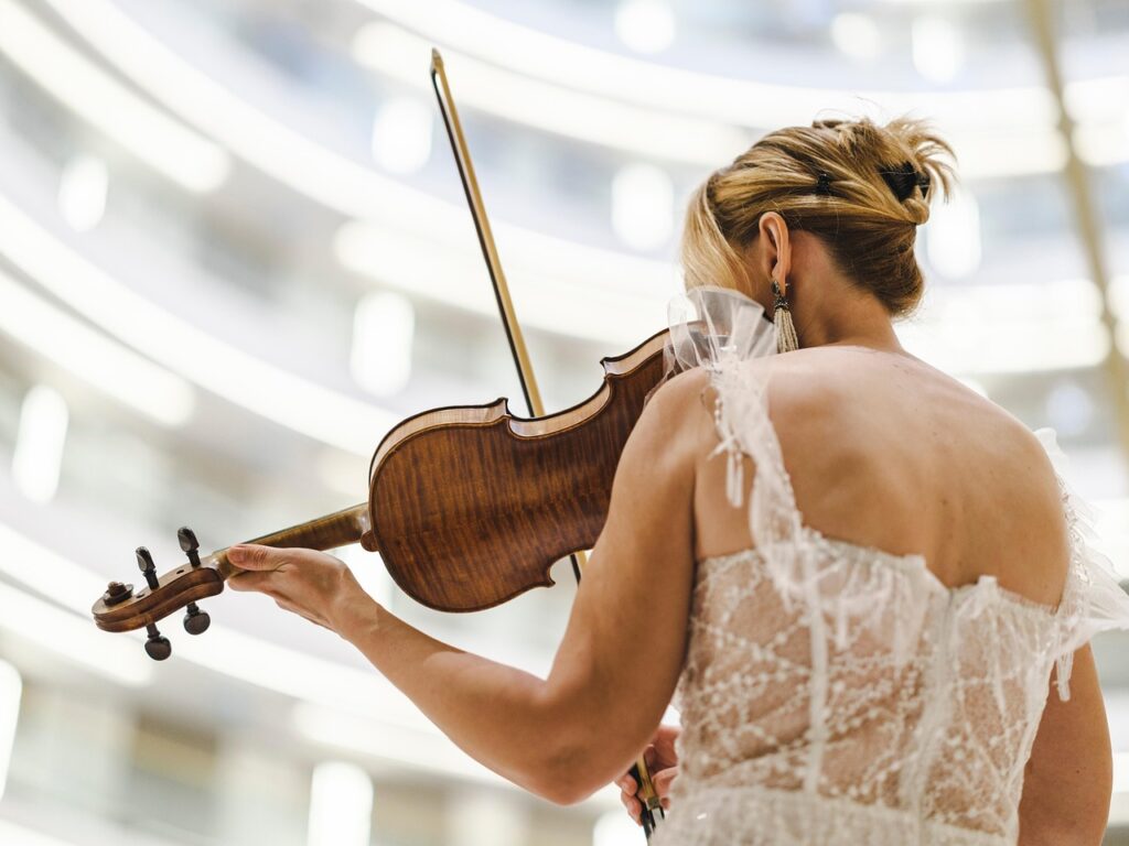
Negative space isn’t filler it’s a tool. A blank wall behind a model, a wide swath of sky above a single tree, the absence of clutter in a still life. These aren’t accidents. They’re deliberate choices to make the subject impossible to ignore.
In portrait photography, isolating a subject with soft, blurred backgrounds or clean empty surroundings pulls the eye exactly where it needs to go face, expression, gesture. Nothing else competes. Still life artists use empty tabletop or canvas corners to bring sharp clarity to an object a pear, a bottle, a book. Even abstract painters know to leave portions untouched, allowing the central motif to breathe and dominate.
To master contrast without turning the frame into visual noise, keep these in play: limit your color palette, exaggerate light and shadow, and step back. If something doesn’t support your subject directly, let it go. Sometimes it’s not about adding more it’s about subtracting everything that doesn’t matter.
Tension & Balance: Let the Void Work
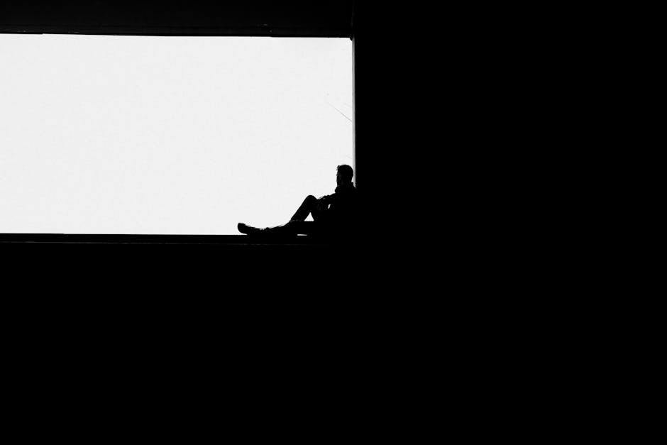
Symmetry feels safe. Asymmetry, though that’s where things get interesting. In a composition, breaking balance grabs the viewer’s attention on instinct. Our brains want order, so when things are arranged just off center or placed in unexpected spots, we lean in, trying to make sense of it. This is where negative space becomes a real tool acting as counterweight, breathing room, and tension builder all at once.
Play with scale. Set a small element against a wide open space and you’ve got instant drama. A larger subject pressed to one edge makes the rest of the canvas feel loud in its emptiness. Placement matters just as much: isolating a figure in one quadrant of a piece, for example, forces the eye to linger, to wonder why it’s alone. Every inch of void becomes a statement.
And when less is more? That’s not a trend it’s a discipline. Strip away the filler and you’re left with intention. The emptiness isn’t lacking it’s waiting. Give the viewer space to think, pause, feel. That’s where the good stuff takes hold.
Shape by What’s Not There

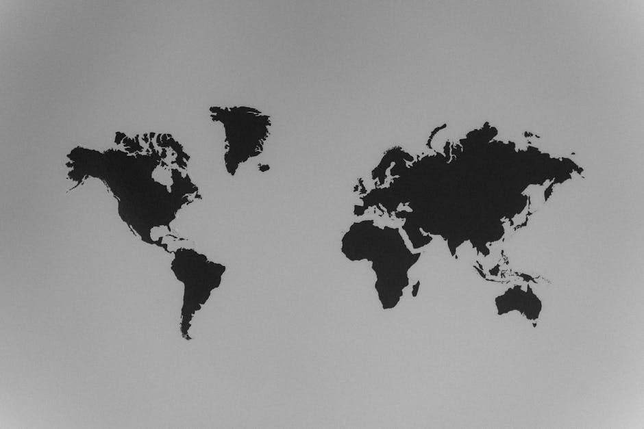
Some of the most compelling compositions in 2026 aren’t about what’s drawn they’re about what’s deliberately left out. Inverted silhouettes and cut outs continue to turn heads, proving that shape can emerge powerfully from absence, not just presence. When done right, a blank space can define a subject more crisply than any line.
Artists are also doubling down on optical illusions and dual imagery, turning the background into part of the story. A single void can toggle between meanings depending on how the viewer looks at it a face morphs into a vase, a staircase becomes flat. This isn’t a parlor trick; it’s spatial psychology at work.
Underlying it all are Gestalt principles in action. Closure lets the brain finish the picture when pieces are missing. Figure ground flips the relationship between object and space. Continuity helps us trace invisible paths through blankness. These principles aren’t just theory they’re tools, and today’s artists are using them with purpose.
Negative space isn’t a passive backdrop. It’s doing real work. And the smart creators are letting it do more of the talking.
Layered Techniques with Mixed Media
Negative space doesn’t always mean blank canvas. In mixed media, it’s where the magic often starts. Using collage, cut outs, and overlays, artists are now carving space just as much as they’re filling it. A torn edge, a missing corner, a transparent overlay each becomes a deliberate silence in the visual conversation.
Leaving something unstated isn’t a compromise, it’s a strategy. When you don’t fill every inch, you’re inviting the viewer to complete the image in their own mind. That gap between what’s seen and what’s suggested can hit harder emotionally than anything spelled out in bold. It gives your work space to breathe, and your audience space to feel.
The best examples blend texture and restraint: a single layer peeled away to reveal form, a neutral void surrounded by chaos, or a simple cut out transforming the narrative. These approaches don’t just guide the eye they provoke it.
For more on elevating your texture game with intention, explore Mastering Texture: Tips for Mixed Media and Collage Artists.
Digital Tools for Precise Use of Space
Vector design software has unlocked a new level of control when it comes to mastering negative space. Unlike traditional mediums where decisions are often permanent, vector platforms like Adobe Illustrator or Affinity Designer let artists plan voids down to the pixel. Layers, grids, and alignment tools aren’t about being flashy it’s about being intentional. You can draw nothing and still say something.
In digital compositions, understanding positive vs. negative layers is critical. Positive space holds your subject the leaf, the face, the type. Negative layers are everything else: backgrounds, silence, air. Smart artists use masking and separation tools to make these two interact on purpose. It’s not just about filling space; it’s about designing what’s left out.
Before you commit anything to canvas, test it. Digital mockups let you toggle visibility, move elements around, and preview how the eye flows across the design. It’s like running a soundcheck before a live show. Don’t skip that step. In the end, composing with space is about awareness more than complexity. These tools don’t make the work for you they just help you see it more clearly.
Final Tips for Artists in 2026
Let the silence speak. In 2026, the boldest artistic statement might be what you leave out. Negative space isn’t a gap to fill it’s a space to trust. When you leave room in your composition, your viewer doesn’t just look, they participate. That psychological engagement is what gives quiet pieces their staying power.
Strip things back. Let your subject breathe. If your work feels too crowded, subtract rather than add. Simplicity isn’t a lack of effort it’s a discipline. Creating visual calm often takes more focus than chaos does.
A good way to train your eye? Sketch one thing every day using nothing but negative form. No shading, no detail. Just shape, void, and form. The more you lean into restraint, the more fluently you’ll speak with less.
This year, the standout artists aren’t competing in volume they’re commanding attention with quiet. In 2026, space is your strongest line.