What’s Driving the Color Narrative in 2026
In 2026, color isn’t just a design decision it’s a mirror. Climate change, digital saturation, and global uncertainty are pushing the visual arts toward tones that do more than dazzle. They ground us. Artists are using palettes not only to reflect how the world feels, but to cope with it. The result? A steady shift toward colors that feel rooted, honest, sometimes even austere.
Climate concerns are fueling a rise in earth derived hues colors that borrow directly from soil, stone, rust, and water. Socially, there’s a fatigue with overstimulation. Viewers are trending toward palettes that soothe, not shout. Brightness hasn’t disappeared, but it’s been filtered through realism. Even in digital work, you’ll see more muted undertones, more intentional quiet.
Meanwhile, tech continues to play its wildcard role. AI generated palettes are blending unlikely combos, while screen based art pushes RGB driven limits. But even here, we see resistance a return to analog textures, to subtlety over spectacle.
Globally, the color story is splitting. We’re not moving toward a single, unified trend. Regional identities are asserting themselves. Artists in different parts of the world are leaning into local pigments and cultural histories, building visual languages with personal roots. In short: fragmentation over consolidation. It’s not chaos it’s creative sovereignty.
Dominant Palettes This Year
Earth Tones 2.0
Earth tones have never really left the stage, but in 2026, they’ve learned some new moves. Gone are the flat beiges of corporate walls this time, we’re talking depth. Burnt ochres, mineral greens, and textured neutrals bring a sense of heat and grounding. These aren’t just colors; they’re reactions to climate anxiety, to digital overload. They speak to raw materiality and deliberate slowness. Think of them as elemental, not trendy.
Digitized Pastels
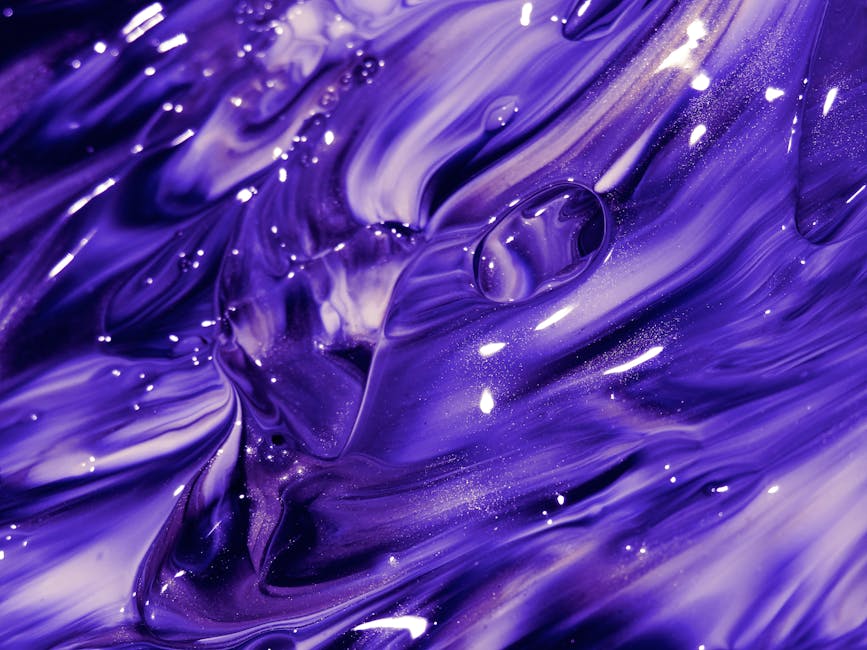
Now take pastels and run them through a glitch filter. What you get are colors that hint at softness but pulse with synthetic life. Lavender edged with electric blue. Peach glow overlaid with chromatic noise. Digitized pastels walk the line between analog calm and algorithmic edge. They reflect the blurred boundary where AI and human creativity intersect and they’re catching the eye in everything from gallery projections to product packaging.
Desaturated Noir
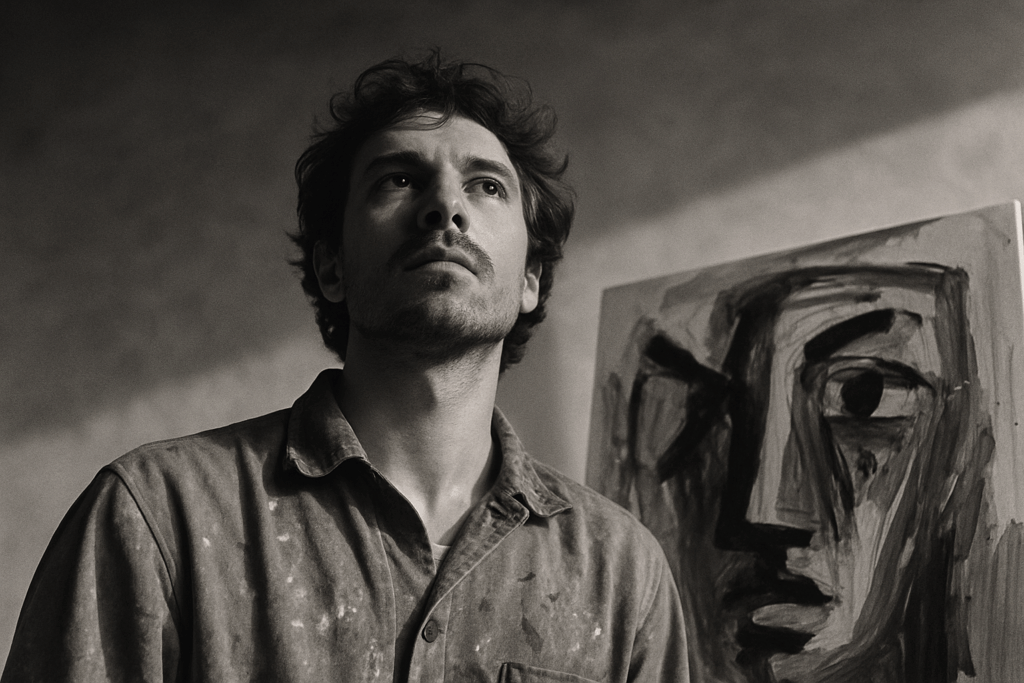
If the visuals of 2026 had a mood, this would be it. Desaturated noir strips the canvas clean. Charcoal, ash white, muted slate it’s minimalism with memory. These shades carry weight without speaking loudly. They’re used by artists who want their message to linger, to slow time. In a world of over saturation, this is restraint, and it cuts deeper than flashy color ever could.
Regional Variations in Color Use
Asia Pacific: Cultural Reds Reimagined with Digital Cools
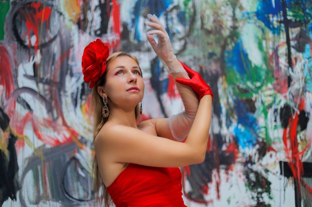
Red has long held cultural weight across the region from China’s prosperity symbolism to Japan’s ceremonial palettes. In 2026, those reds aren’t disappearing; they’re being reshaped. Think crimson tinged with cyber blue, traditional patterns animated with iridescent overlays. This fusion of heritage and hyper modern surfaces is powering everything from film grading to packaging design. It’s a cultural remix, sharp and self aware.
Europe: Greyscale Revival with Eco Infused Accents
Europe’s mood board has turned deliberately muted. Greys slate, ash, concrete anchor compositions, while hints of reclaimed green, terracotta, and algae blue inject life. The aesthetic nods to both urban austerity and sustainability. This isn’t dull minimalism it’s restraint with agenda. In galleries and fashion lookbooks alike, the quiet urgency of climate and design co exist.
Africa + Middle East: Reclaiming Traditional Pigments for Modern Storytelling
Across African and Middle Eastern creative circles, the return to native pigments isn’t nostalgic it’s strategic. Artists and designers are tapping into indigo, saffron, henna, and malachite with new purpose. These colors, often extracted from local earth and plant sources, are resurfacing in digital canvases and film but with contemporary narratives. This is heritage as forward motion, not retro branding.
Americas: Duality of Bold Optimism vs. Nostalgic Filters
North and South America are in a tug of war between the future and the familiar. Bright primaries canary yellow, hard reds, cobalt blue channel a neon confidence. But just as common: vintage tones, dusty pastels, and sepia edged aesthetics that feel like a worn photograph. Expect this duality to strengthen in 2026: part Gen Z bravado, part collective longing.
Tech + Sustainability = New Color Behavior
Art is getting smarter and cleaner. The rise of pigment conserving tools and low emission paint solutions is nudging traditional artists toward more sustainable studios. Manufacturers are rolling out water based alternatives that pack vibrant impact without the chemical trail. Brushes and spray systems now optimize pigment use down to the gram, which means less waste and longer lasting materials. For many creators, this isn’t just about saving the planet it’s about cutting costs and building smarter workflows.
But the biggest shift? It’s happening in pixels. Digital art is rewriting what we even mean by “color fastness.” There is no fading or cracking in the digital realm. Instead, creators are thinking about how color holds up across devices, file types, and evolving screen technologies. Saturation control, lighting variations, and accessibility all factor into how digital color behaves and ages in front of a viewer’s eye.
As sustainability deepens its roots in creative culture, both paint and pixels are under the microscope. For a closer look at how this movement is evolving, check out The Rise of Eco Art: Sustainability in Modern Creativity.
What to Watch Moving Forward
Color is no longer just seen it’s felt, moved through, and interacted with. As AR and VR move from experimental to essential in visual art spaces, the way we think about palettes is shifting. Immersive color design isn’t just about matching tones to themes it’s about shaping an emotional space. Artists are building full body environments with gradients that guide moods, hues that change as viewers move, and tones that respond to digital touchpoints. The palette is now a place.
Meanwhile, branding continues to seep into curatorial decisions. Galleries and institutions are opting for consistent color themes that align with their identity systems safe, clean palettes that translate well across digital and physical channels. The result: curated spaces that feel more like retail campaigns, and artists either adapting or pushing back.
On the other end of the trend spectrum is color fatigue. After years of hyper saturation, some artists are dialing back. Intentional monotony restricted palettes, grayscale washes, and muted silhouettes is taking hold in both digital and analog works. It’s a quiet rebellion against the visual overload, asking viewers to slow down, notice the small shifts, and maybe even breathe again.
For Artists, Collectors, and Curators
Viewer preferences in 2026 are more fluid and more polarized than ever. Audiences aren’t just looking for beauty or innovation; they want relevance, mood, meaning. That doesn’t mean abandoning personal style. It does mean sensing the cultural temperature and adjusting your palette without losing your voice.
Color is no longer just a design choice. It’s market language. Hues that resonate emotionally tend to succeed longer than ones chosen solely for trend chasing. A piece veiled in dusty jade might not pop in a thumbnail, but in context especially with collectors seeking slow art it sells. Meanwhile, ultra high chroma palettes that scream for attention might bring short term traction but stall in curation and resale.
One tactical approach: keep your base palette consistent, but rotate in one or two awareness driven shades each season. Use limited test drops to measure response before going all in. Palettes can evolve without turning into trend soup. Keep the core grounded. Let color serve story, not the other way around.
