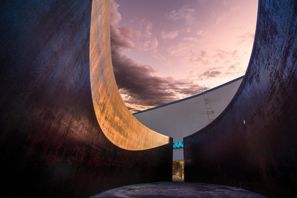
Why Layering Matters in 2026
Creating paintings with emotional resonance and visual complexity often comes down to one crucial skill: layering. While bold colors and clever composition can turn heads, it’s depth that keeps a viewer engaged. Flat paintings may tell a story, but without dimension, they lose impact.
Why Flat Paintings Fall Short
Lack of layering results in a static, lifeless look
Visual storytelling depends on space and form
Without depth, a painting risks feeling unfinished or amateurish
The Power of Dimensional Work
Layering creates weighted space inviting the viewer to move through the painting, not just look at it. Artists who use layering effectively often report stronger emotional reactions to their work from audiences.
Viewers tend to linger longer on artwork with visible depth
Subtle transitions in value and color create realism and atmosphere
Layered pieces communicate movement, mood, and story more powerfully
Digital or Traditional Depth Still Wins
Whether you’re crafting with brushes or a stylus, the concept remains the same: depth connects. Layering enhances storytelling in both traditional paints and digital environments.
Digital artists use opacity, blend modes, and texture brushes to mimic real world layers
Traditional painters rely on techniques like glazing, scumbling, and impasto
Regardless of the medium, well executed layers create tension, harmony, and spatial clarity
In short, depth isn’t just a visual trick it’s a storytelling tool. Layering is how you make a flat canvas speak in three dimensions.
Foundational Layers
Start loose. The first layer of any good painting isn’t supposed to look like much. It’s a roadmap, not a destination. Use thin washes or light sketching to block in the big shapes and values not details. The goal here is to get a rough sense of form, proportion, and movement.
Once that’s down, it’s time to push a little under the surface. Complementary colors think reds under greens, blues under oranges can give your final image a subtle energy. Even if they’re mostly covered later, they peek through just enough to keep things lively. It’s controlled chaos, and it works.
Then comes glazing. This is the discipline: transparent layers brushed over dry paint to shift color and value without scrubbing out what’s underneath. One glaze warms a shadow. Another deepens a midtone. Layer by layer, you start to build realism without grinding detail into every inch. It’s about letting light bounce through the paint. Done right, glazing creates that depth you can’t fake.
These early steps won’t be flashy. But with layering, substance always starts before surface.
Mid Layers: Building Volume and Space
Here’s where your painting starts to breathe.
First don’t just change colors. Shift values. Light to dark is what sculpts form on a flat surface. If your object isn’t popping, odds are your values are too close together. You need contrast in the right places not everywhere. A strong value structure does more for realism than any fancy brushwork.
Next up: edges. Soft edges suggest depth. Hard edges grab attention. Knowing when to blend and when to leave a crisp line is what gives your work focus. Push distant forms back with foggy edges. Sharpen the lines where you want the viewer to land.
Finally, don’t forget the emptiness. Negative space isn’t dead space. It’s a shape maker. Let it define your subjects without over outlining them. Sometimes, leaving an area untouched is the boldest stroke of all.
This mid layer phase is less about decoration and more about structure. Nail the values, work your edges, and let space talk. That’s how you make flat canvas feel like real space.
Top Layers: Highlights, Textures, Final Mood

This is where the painting breathes. Once the foundational and mid layers are in place, the final marks should be deliberate. Impasto applying paint thickly adds physical texture that catches light in a way no digital trick can fully replicate. Dry brushing gives a scratchier, uneven mark that evokes worn surfaces, distant light, or even movement, depending on how and where you use it. Both techniques inject energy and break predictability.
Strategic highlights aren’t about going wild with white paint. They’re about restraint. Use brighter values to pull forward specific shapes or focal points cheekbones, roof tiles, a glass in sunlight. A well placed highlight can lead the viewer’s eye better than arrows ever could.
Lastly, use color temperature like a director uses lighting. Warm tones (yellows, reds, warm grays) pull areas forward. Cool zones (blues, greens, cooler neutrals) push them back. Alternating these in your uppermost layers creates a sense of air and spatial hierarchy. Think of it as temperature guided traffic control for the eye.
Top layer work doesn’t have to be heavy handed to be effective. The goal is to finish with intention light, texture, hue all doing their jobs quietly but clearly.
Real Life = Better Layers
Why Observing From Life Matters
Creating depth isn’t just a matter of technical process it begins with observation. Studying light, form, and atmosphere in real environments helps train your eye to see subtle relationships and layering opportunities, which translates directly into your work, digital or traditional.
Light behaves differently in reality than in reference photos
Natural scenes reveal organic transitions in shadow and color
Real world observation improves your understanding of spatial depth
Go Beyond the Details
When painting from life, don’t obsess over replicating every object or surface. Focus instead on mood and atmosphere. Capturing the feeling of a place often leads to more convincing and emotionally resonant artwork.
Suggest details with brushwork rather than define everything
Use color and value shifts to evoke time of day or weather
Let the light direction guide your layer placement
Practice Tip: Paint a Scene in Layers
Head outdoors or set up a still life and challenge yourself to simplify the scene into three dominant layers:
- Background: Large atmospheric shapes for sky, distant land, or soft gradients
- Midground: Main forms with clear shape definition and value control
- Foreground: Sharp edges, texture, and detail to bring the scene forward
This exercise builds a stronger instinct for value grouping and spatial logic.
Want to refresh your foundational skills first? Check out: Beginner’s Guide to Drawing from Real Life
Bonus Technique: Layering Across Mediums
Mixing mediums isn’t just for breaking rules it’s one of the fastest ways to add richness and dimension to your painting. Start light: watercolor washes give you soft gradients and unpredictable spontaneity. Adding ink lines over the top tightens the form and brings clarity without losing that dreamy base. It’s great for urban sketches or stylized portraits where personality matters as much as form.
Acrylic over textured paper changes the game too. The raised surface grabs paint in unexpected ways perfect for showing aging wood, weathered skin, or broken landscapes. It’s tactile and a little uncontrollable, which is exactly the point.
For digital artists, layering isn’t about paint it’s about smart blending. Stack blend modes (overlay, multiply, color dodge) to pull traditional painting effects into your screen workflow. Want that oil like warmth or watercolor like glow? It’s not about the brush it’s about how you stack your layers.
Go traditional, digital, or hybrid it doesn’t matter. What counts is how your layers talk to each other.
Final Pass: Judging Depth Before You’re Done
Time to step back. Literally. One of the simplest but often skipped checks: the squint test. Half close your eyes and look at the painting if the depth collapses into a flat mess, go back and adjust your values. Good layering should hold up, even when details blur.
Now flip it upside down. Sounds strange, but it works. Rotating the canvas forces your brain to stop naming objects and instead assess pure composition. Are the weight and balance still there? If one side feels heavy, chances are the viewer will read it that way too.
Finally, ask yourself where does your eye land first? And once there, does it stay or drift aimlessly? Smart layering creates visual gravity. Use contrast, edge quality, texture, and temperature shifts to guide the gaze. Let the viewer feel pulled, not pushed.
Depth isn’t just shown it’s felt. Learn to read your own work like a stranger would. The eye never lies.
 Zyphren Kryndall is the kind of writer who genuinely cannot publish something without checking it twice. Maybe three times. They came to inspiration and resources through years of hands-on work rather than theory, which means the things they writes about — Inspiration and Resources, Creative Techniques and Tutorials, Gallery Exhibitions and Reviews, among other areas — are things they has actually tested, questioned, and revised opinions on more than once.
That shows in the work. Zyphren's pieces tend to go a level deeper than most. Not in a way that becomes unreadable, but in a way that makes you realize you'd been missing something important. They has a habit of finding the detail that everybody else glosses over and making it the center of the story — which sounds simple, but takes a rare combination of curiosity and patience to pull off consistently. The writing never feels rushed. It feels like someone who sat with the subject long enough to actually understand it.
Outside of specific topics, what Zyphren cares about most is whether the reader walks away with something useful. Not impressed. Not entertained. Useful. That's a harder bar to clear than it sounds, and they clears it more often than not — which is why readers tend to remember Zyphren's articles long after they've forgotten the headline.
Zyphren Kryndall is the kind of writer who genuinely cannot publish something without checking it twice. Maybe three times. They came to inspiration and resources through years of hands-on work rather than theory, which means the things they writes about — Inspiration and Resources, Creative Techniques and Tutorials, Gallery Exhibitions and Reviews, among other areas — are things they has actually tested, questioned, and revised opinions on more than once.
That shows in the work. Zyphren's pieces tend to go a level deeper than most. Not in a way that becomes unreadable, but in a way that makes you realize you'd been missing something important. They has a habit of finding the detail that everybody else glosses over and making it the center of the story — which sounds simple, but takes a rare combination of curiosity and patience to pull off consistently. The writing never feels rushed. It feels like someone who sat with the subject long enough to actually understand it.
Outside of specific topics, what Zyphren cares about most is whether the reader walks away with something useful. Not impressed. Not entertained. Useful. That's a harder bar to clear than it sounds, and they clears it more often than not — which is why readers tend to remember Zyphren's articles long after they've forgotten the headline.